Stand Up.
From a specialist device to self-service measurement
I helped turn a measurement within a professional device into a standalone screening service. My work connected product scope, sensor fitting, posture guidance, and mobile results, including responsive frontend implementation of the mobile report.
- Responsibility
- Product planning · UX/UI · Brand · Design system · Mobile frontend
- Collaboration
- Hardware · Medical data analysis
- Initial delivery
- 2024.11–2025.01
- Touchpoints
- Kiosk · Sensor · Mobile report
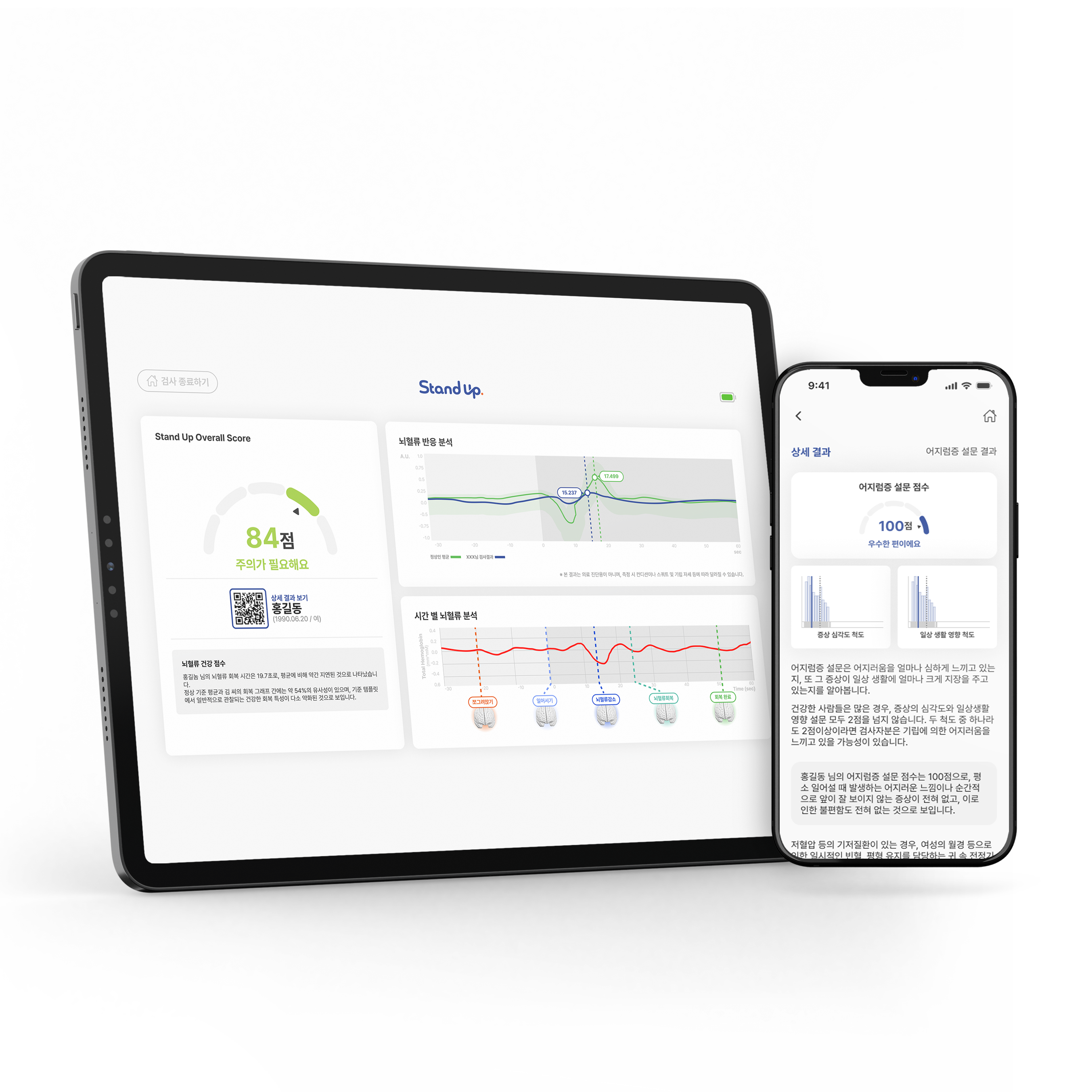
Product scope shaped by the screening environment
Existing customers and the sales team repeatedly asked for blood-flow measurement as a separate product with lower cost and simpler operation. This feedback shaped a standalone service from NIRSIT EYE, with a scope extending from on-site guidance to access to results.
Starting point
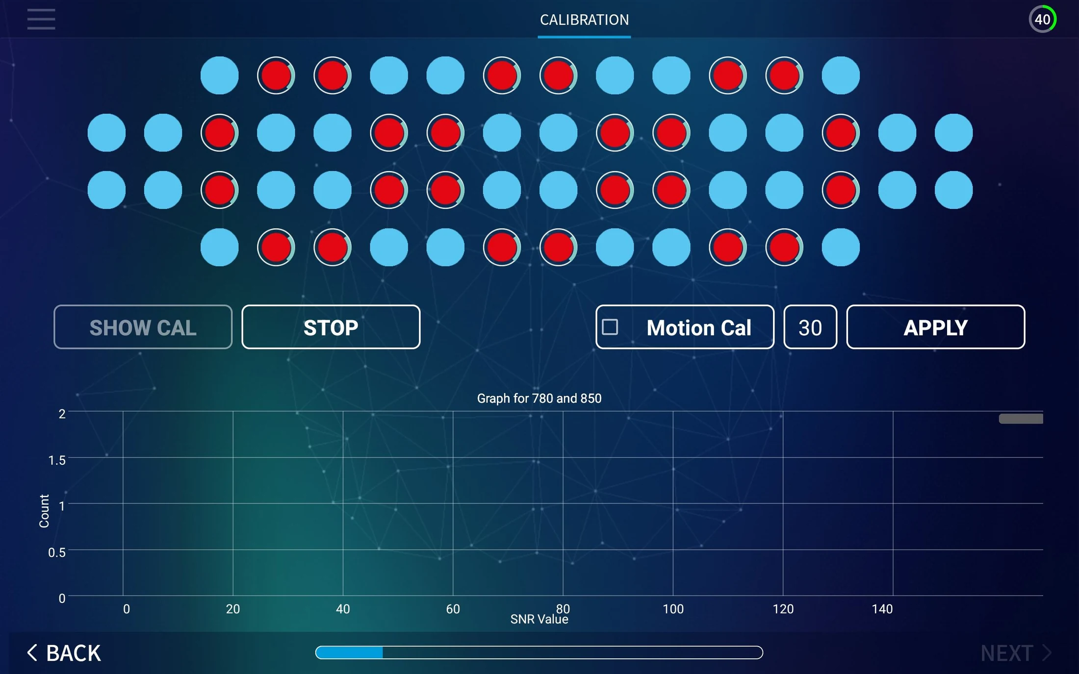
The product challenge included simpler screens and a concrete specification for guidance, device states, and exceptions previously explained in person.
- Focus
- Blood-flow measurement during posture changes
Made the relevant measurement the core of a standalone product.
- On the kiosk
- Fitting · Signal checks · Measurement · Summary
Kept essential actions and readiness checks within the measurement sequence.
- On mobile
- Detailed results · Symptom survey · Follow-up information
Moved the detailed survey to mobile after measurement to reduce time spent waiting on site.
A journey that accounts for both the person and the device
Each stage needed a clear action for the user and a corresponding state for the system. The journey continued beyond measurement to result delivery on a personal device.
- 01
Fitting
UserAlign the sensor
ProductPlacement references and contact guidance
- 02
Readiness
UserConnect and remain still
ProductConnection, calibration, and readiness
- 03
Measurement
UserSquat and stand
ProductAdvance cues and posture feedback
- 04
Results
UserRead scores and change over time
ProductAnalysis and remeasurement branch
- 05
Delivery
UserOpen via QR or KakaoTalk
ProductContinue to results and survey
Connect each fitting error to a useful recovery action
A missing device, poor contact, and incorrect orientation require different responses. I separated these states and designed guidance around the action each one needs.
A visible reference for sensor placement
The fitting example marks the eyebrow line and the center of the face. Instructions call out hair between the sensor and forehead, giving users a concrete check before measurement.
Microinteractions that guide breathing and the moment to move
The 3-minute-30-second measurement follows one minute standing, 90 seconds squatting, then one minute standing again. I paired concise guidance with small movements to support comfortable breathing, preparation for the next action, and posture changes at the intended time.
Interaction replay
From comfortable breathing to a change in posture

Hold your posture

The breathing motion is a visual rhythm for staying comfortable. Squat and Stand replay the final 10 seconds before a transition. Enable sound to hear the original countdown in the last three seconds.
- 01Comfortable breathing
A slowly contracting and expanding circle supports a comfortable, steady posture.
- 0210-second notice
Prepare the handrail and the next action while maintaining the current posture.
- 033-second audio cue
Visual and audio countdowns mark the last three seconds before the change.
- 04Change posture
A downward arrow cues squatting; an upward arrow cues standing.
An iteration informed by measurement data
Add an audio cue for a more precise transition
Understanding an action and performing it at the intended moment are different problems. After designing visual guidance, mistimed movements in actual measurements prompted a further refinement of the transition cue.
- Observation
- Measurement analysis repeatedly showed users squatting or standing earlier or later than instructed. Mistimed posture changes were affecting measurement accuracy.
- Response
- I added an audible countdown starting three seconds before squatting or standing. The audio cue supplements advance notice and directional motion, making the transition moment easier to recognize.
- Design principle
- Use a calm rhythm while the posture is held, then a distinct cue just before movement. Supporting reliable measurement meant treating physical behavior as part of the interaction design.
View the earlier screens and original interaction video
Reinforce the behavior to maintain
While the user is squatting, guidance cycles through facing forward, breathing comfortably, and keeping the device still.

The earlier Figma prototype contains a five-second visual countdown. Measurement analysis later led to an audio cue in the final three seconds. The replay above brings the original motion components and the later audio refinement together.
Lead from the key score to the pattern behind it
The kiosk prioritizes the overall score and status, then explains the score and the changes over time. Measurement and survey scores are distinct, including a separate presentation for a survey that has not been completed.
- 01
- Summary
Score and status introduce the main result
- 02
- Explanation
The selected score reveals its explanation
- 03
- Action and data
Posture changes and recovery stages map to the graph
Continue the experience after the measurement ends
QR and KakaoTalk give users a route back to their results. On mobile, the experience continues through a summary, detailed interpretation, and symptom survey. I implemented the responsive frontend as part of that delivery.
Keep a route back when result delivery is skipped
Closing the KakaoTalk dialog leaves a delivery button on the result screen. Empty and completed phone-number states are distinct, alongside the option to open the report via QR.
A design system for reusable states and actions
Shared components specify state, size, and context as well as appearance. Inputs, buttons, progress, device indicators, and scores follow consistent rules across screens.
- State
- Active · Disabled · Warning
Distinguished whether an action is available and when it requires attention.
- Scale
- 48 / 56 / 80 px
Three heights and filled, outlined, or text treatments support different contexts.
- Structure
- Progress · Device state · Result modules
Progress, battery states, and score modules were shared components. Icons use the Ionicons library.
Carry the identity across product touchpoints
The blue wordmark and orange accent extend across the kiosk, app icon, and KakaoTalk channel. Related forms align Stand Up with Mind Speak in the product lineup.
A later revision separates questions before and after the test
The early flow included a longer symptom survey using a 0–10 scale. The June 2025 design revision separates usual symptoms before the test from symptoms experienced during it, using short questions with three response states.
Specify both the question context and the selected state
Usual symptoms and the experience of this test are different information. The revision distinguishes when a question applies and defines selection feedback as component states. The longer survey remains a separate part of the mobile result flow.
This is the June 2025 Figma revision. Deployment and the effect of this change have not been verified here.
From product scope to implementation and field adoption
Stand Up was adopted at KMI health screening centers. My work connected product planning, kiosk and mobile UX/UI, and the design system, through to implementation of the responsive mobile report.
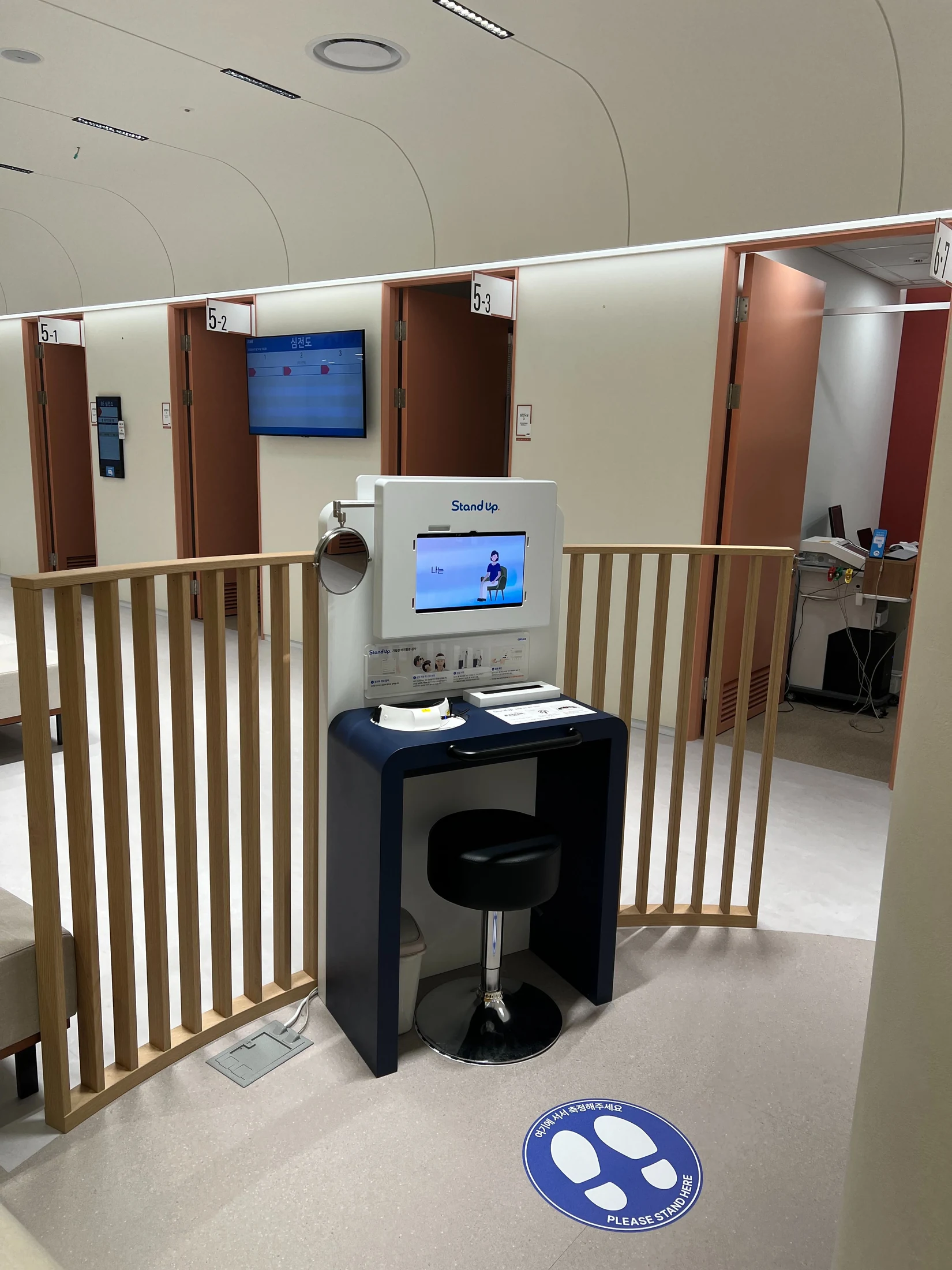
Recorded use at the first installation
Weekly usage at the first installation, as recorded when the 2026 portfolio was prepared. Following the January 2025 launch, the product entered repeated use in a screening setting.
- Planning
- Define scope and the role of each touchpoint
- Design
- Specify physical actions, device states, and exceptions
- Implementation
- Build the responsive mobile result frontend
The product scope extends to understanding the result and knowing what to do next.
For Stand Up, I shaped a measurement function into a standalone product and connected human movement with device state. The work brought screen design, service scope, exception handling, and result delivery into the same product responsibility.
Design sources and revisions
Reviewed all 15 Figma pages: 12 content pages and three empty separators. Screens, component definitions, and revision states informed this case study.
Product and operational context also draws on pages 20–29 of the 2026 portfolio. Page 25 documents breathing and posture guidance; page 28 documents the three-second audio countdown added after measurement analysis.
- Squatting motion ↗
- Standing motion ↗
- Breathing cue · orange ↗
- Breathing cue · blue ↗
- Measurement flow and exceptions ↗
- Timed measurement prototype ↗
- Design system ↗
- January 6, 2025 result screens ↗
- January 14, 2025 mobile results ↗
- January 23, 2025 KakaoTalk delivery ↗
- June 2025 UI revision ↗
- Shared and printed report drafts ↗