CASE 01 / PRODUCT REDESIGN / HEALTHCARE
Mind Speak.
From device setup to results, an interface that guides the assessment
I redesigned Talk Talk Brain Senior into Mind Speak for psychiatric hospitals and clinics. I led product planning, UX/UI design, and frontend implementation for device fitting, practice, assessment tasks, error recovery, and results, aiming to reduce repeated operator instructions.
- OWNERSHIP
- Product planning · UX/UI · Frontend
- COLLABORATION
- Engineering · Hardware · Medical data analysis
- FOCUS
- Device states · Human actions · Result interpretation
- PERIOD
- 2025.10–11
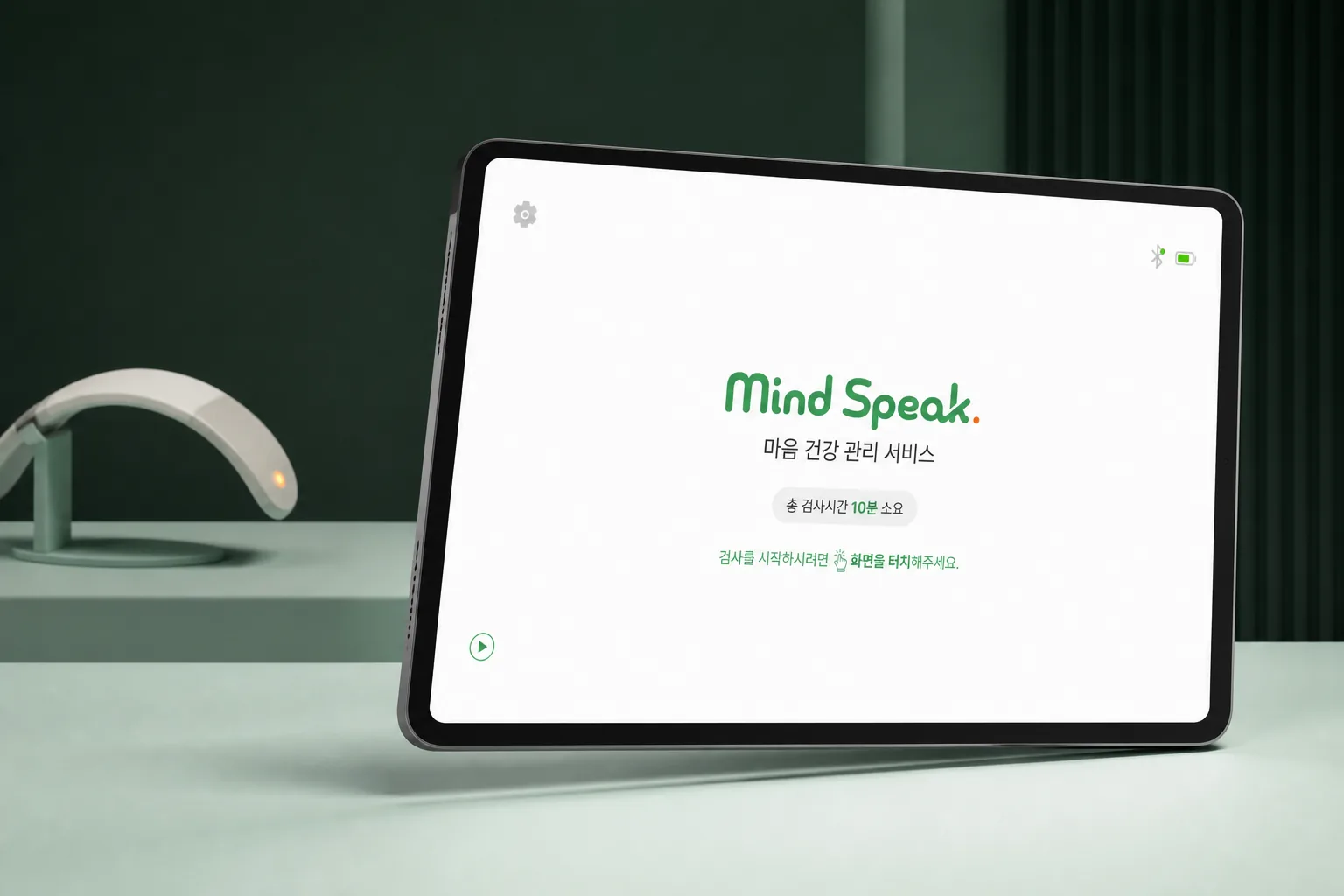
Device setup / Assessment / Recovery / Results
An assessment that relied
on operator instructions
Operators repeatedly explained device fitting, when to speak, and how to use the response button. I added preparation steps and task feedback to help users act on the screen instructions.
No fitting check
The assessment began immediately after the video, with no step for users to verify that they had fitted the device correctly.
Unclear vocalization timing
The “ah-eh-ee-oh-oo” task relied on static copy and a timer, making it difficult to synchronize spoken instructions with actual vocalization.
Limited press feedback
The flat VFT button showed little physical difference before and after a press, so users struggled to confirm whether their input had registered.
Limited result explanations
Measurements and signal quality alone did not explain what the result meant or what to do next.
Assessment stages
and the actions they require
I mapped the combined assessment from questionnaires through stress and brain-activity tasks to the report, then added preparation and guidance for each stage.
- 01Questionnaires
Answer questions about mood and stress.
- 02Stress assessment
Follow the guide and remain still.
- 03Brain activity
Practice, speak, and press the word key.
- 04Report
Review the summary and supporting data.
BEFORE MEASUREMENTConnect → fit → calibrate
BEFORE THE TASKUnderstand → practice → begin
WHEN INTERRUPTEDCheck the state → retry or exit
Combined-assessment example. The sequence and included questionnaires depend on the selected tests and settings.
DESIGN DECISIONI placed guidance where the action occurs: fitting and practice before the assessment, timing cues during the task, and supporting data in the report.
Device fitting and practice
before the assessment
- LIMITATION
- No step to check device fitting after the video
- DESIGN DECISION
- Place setup verification and practice before the assessment
USER ACTIONUsers fit the device and practice the task before starting the assessment.
On-screen cues for
vocalization timing and pace
- LIMITATION
- Vocalization instructions stay unchanged for 30 seconds
- DESIGN DECISION
- Use a start cue and syllable highlights to guide timing and pace
USER ACTIONUsers wait for the start cue, then speak in time with the highlighted syllables.
DESIGN DECISIONI separated vocalization guidance into a start cue, preparation, and syllable highlights. Audio marks the start, and visual emphasis guides the pace, helping users follow the task.
Visual feedback for
raised and pressed states
- LIMITATION
- The flat button made raised and pressed states hard to distinguish
- DESIGN DECISION
- Use the height change of a physical key to distinguish the states
USER ACTIONUsers can identify the pressed state through the change in button height.
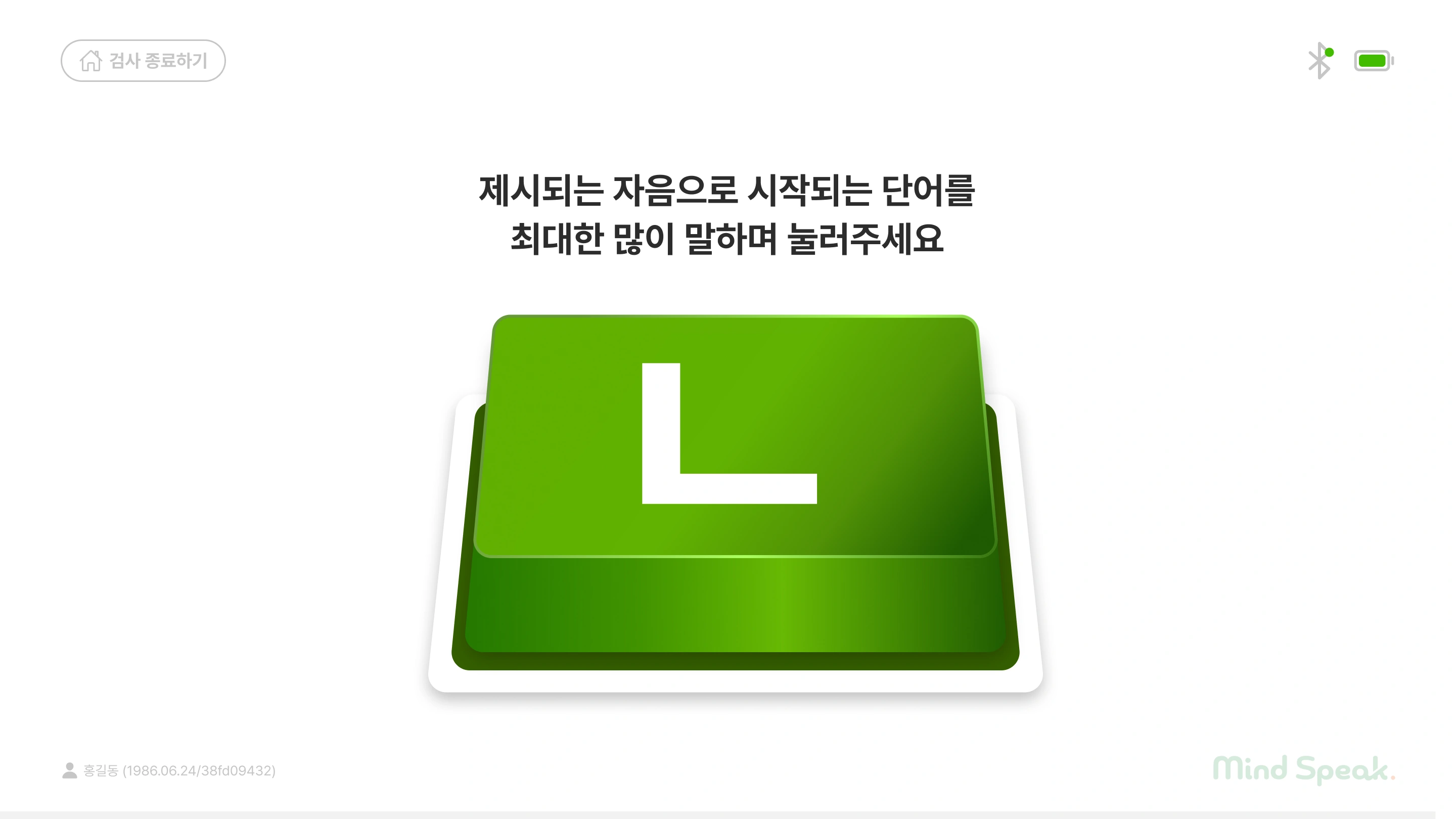
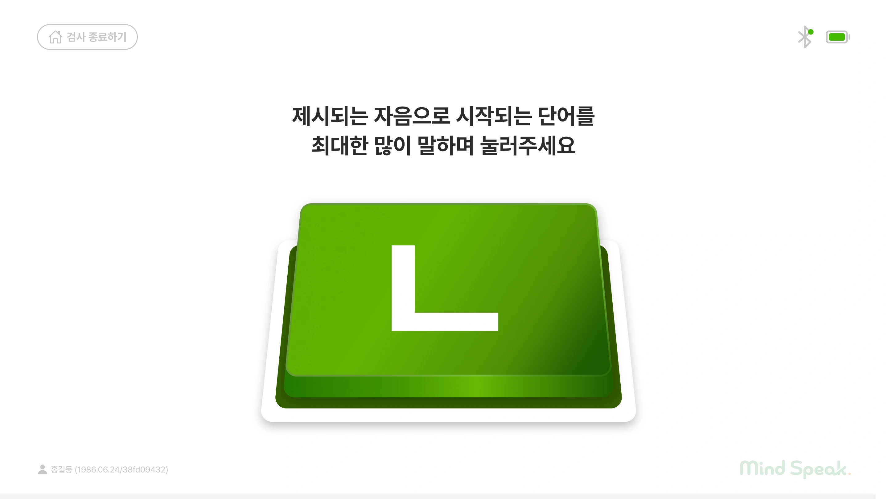
INTERACTION DESIGNI applied the height change of a physical key to the VFT button. The raised state leaves a gap between the keycap and base; pressing reduces that gap, making the two states visually distinct.
Device-state guidance
and recovery actions
- Limitation
- Unclear distinction between waiting and connection failure
- Decision
- Match the message and action to the device state
Calibration preparation
The screen explains how to sit during calibration and provides a start button.
Connection in progress
The screen indicates that the device is connecting and asks the user to wait.
Retry after connection failure
A failed device search prompts a device check and provides a retry button.
Reports tailored to
patients and clinicians
- User needs
- Patients need clear explanations; clinicians need data for interpretation
- Decision
- Separate Basic and Pro information, with guidance based on signal quality
Patient report / Basic
The report leads with the score and its explanation, followed by a brain-map comparison.
Clinician report / Pro
The report brings together the summary score, brain map, radar chart, and HbO/HbR time series.
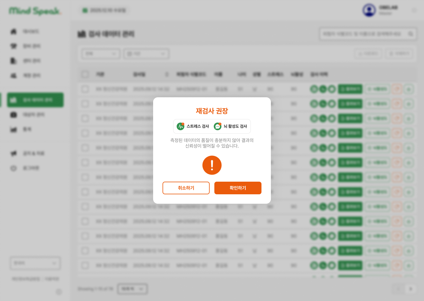
Result guidance based on signal quality
The signal-quality code, red_flag, determines which report and warning to show. It describes measurement quality rather than a diagnosis.
- 0Standard reportReview the summary and supporting data.
- 1CautionShow conditions that affect interpretation.
- 2Retest guidanceExplain insufficient data quality and recommend a retest.
Brand continuity
across the product lineup
I developed the Mind Speak logo from Talk Talk Brain and aligned its visual design with Stand Up to create a consistent product lineup.
Design roots in Talk Talk Brain
I carried the rounded letterforms of Talk Talk Brain into the Mind Speak wordmark, keeping a recognizable connection to the original brand.

Talk Talk Brain

Mind Speak
Visual consistency with Stand Up
I aligned the rounded letterforms and orange accents of Mind Speak and Stand Up. Green for Mind Speak and blue for Stand Up distinguish the two products within the lineup.

Rounded letterforms · Orange accent
Shared components for a consistent experience
I defined shared components for progress, device connection, and input states, with consistent wording and visual feedback across screens.
Shared progress indicators
A shared four-stage component highlights the current assessment stage.
Consistent connection and input states
Shared components define the visual states for connection and input. Text guidance explains the action needed in each state.
Design priorities from the usability evaluation
I evaluated perceived usability with 12 internal participants who had used NIRSIT Lite. The lower scores for connection status, error messages, and result explanations set the priorities for revision.
Internal participants
Prior NIRSIT Lite users · Five-point scale
Design priorities
Connection status · Error guidance · Result clarity
These scores reflect experienced internal participants. Independent task completion by first-time patients and the effects of the revisions require separate field testing.
Connection status, error messages, and result explanations scored lower than assessment startup and procedure guidance. I used that difference to prioritize revisions.
I paired status icons with explanations and clarified the retry path after a connection failure.
I separated the current state from the action the user needs to take.
I separated patient and clinician reports and defined guidance for each signal-quality state.
Assessment guidance starts with
the actions users need to perform.